
JOURNAL / EDITORIAL NOTE
Notes on Type.
An editor’s note on how type choices shape clarity, mood and the relationship between reader and message.
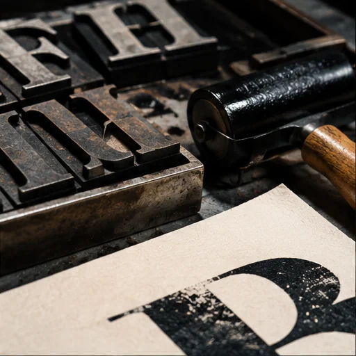
Typography is an everyday language. The best typography guides a reader without asking for attention, but it can also become the personality of an entire composition.
Scale creates the first layer of order. Spacing makes a message feel calm or urgent. Contrast gives a page its pace. Together, these decisions create hierarchy and atmosphere.
Experimentation matters too: switching one font weight or simplifying one column can change how ideas are understood.